We spend a ton a time at home. With Jezriel and I working from home, us cooking and baking constantly, were basically homebodies with two kids. It’s just easier.
I do try to make our place feel comfy and relaxing, however for some reason I just kept putting off our living/dinning areas and office. Technically, I’m still avoiding our office space, but our bedroom and the kids play area is up to par for now.
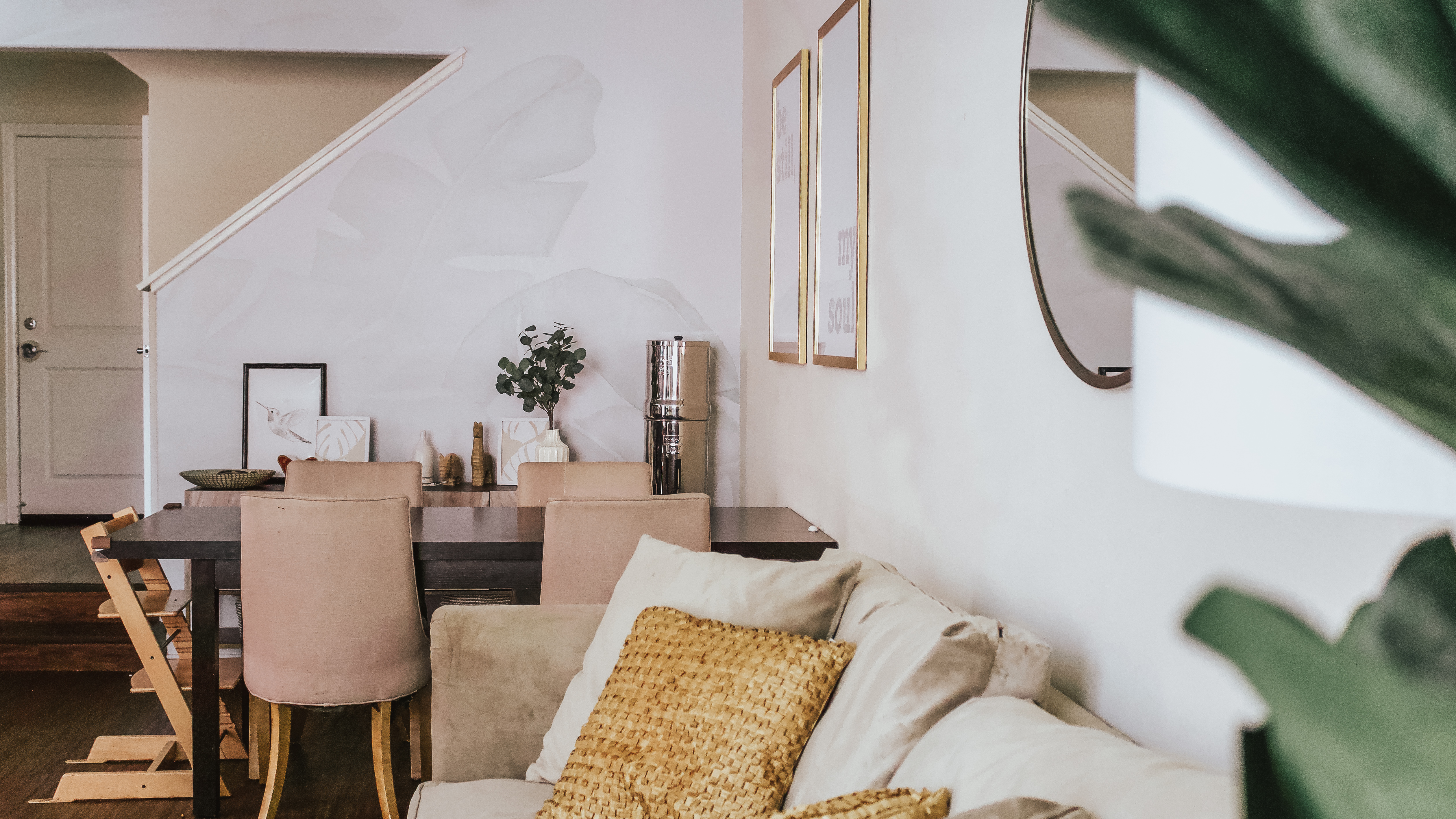
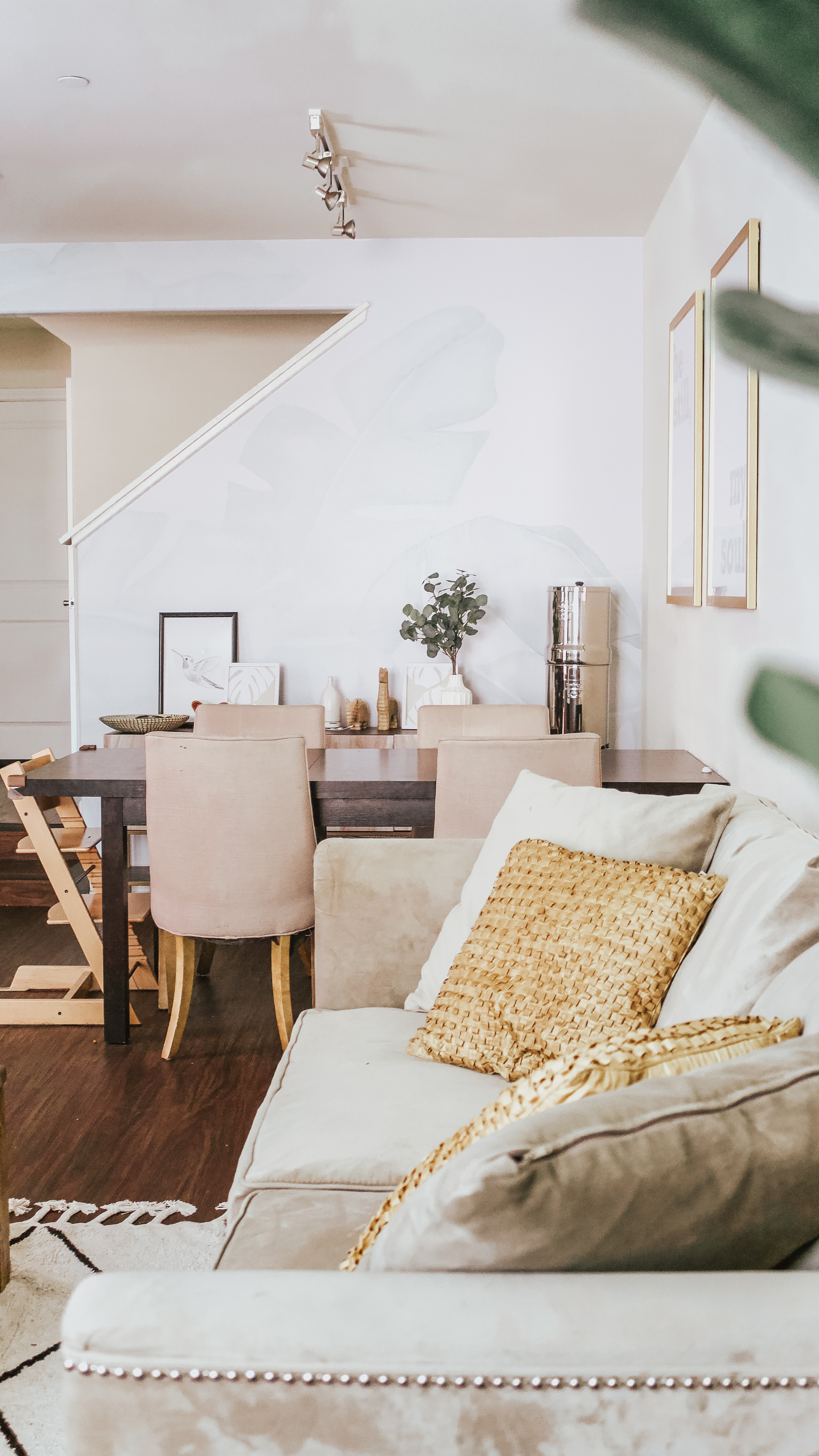
These past few months I’ve really dedicated myself and brighten up our downstairs with the focus of the dining area. It’s such a long narrow space with dark finishes and minimal windows so not a ton of natural light going on there! I’ll do another post when I get to finishing our living space and office.
I rotated quite a few of our existing pieces around our place to different rooms and bought some new things that I felt we needed, but renter friendly of course.
If you can’t tell already I’m a big fan of earthy tones, wood finishes, and simple decor. We try to keep toys at bay. If they don’t have a proper home in the playroom or the one of the baskets downstairs is full, then we have to donate it before adding another. We actually have quite a few baskets around the house in which we use to hide and put away her stuff. I in fact still need to label them to be more organized.
Downstairs, our ceilings are higher than standard, and it makes it challenging to find perfectly scaled decor items. With a ton of searching, online purchases, and drop off returns, I finally found essential pieces.
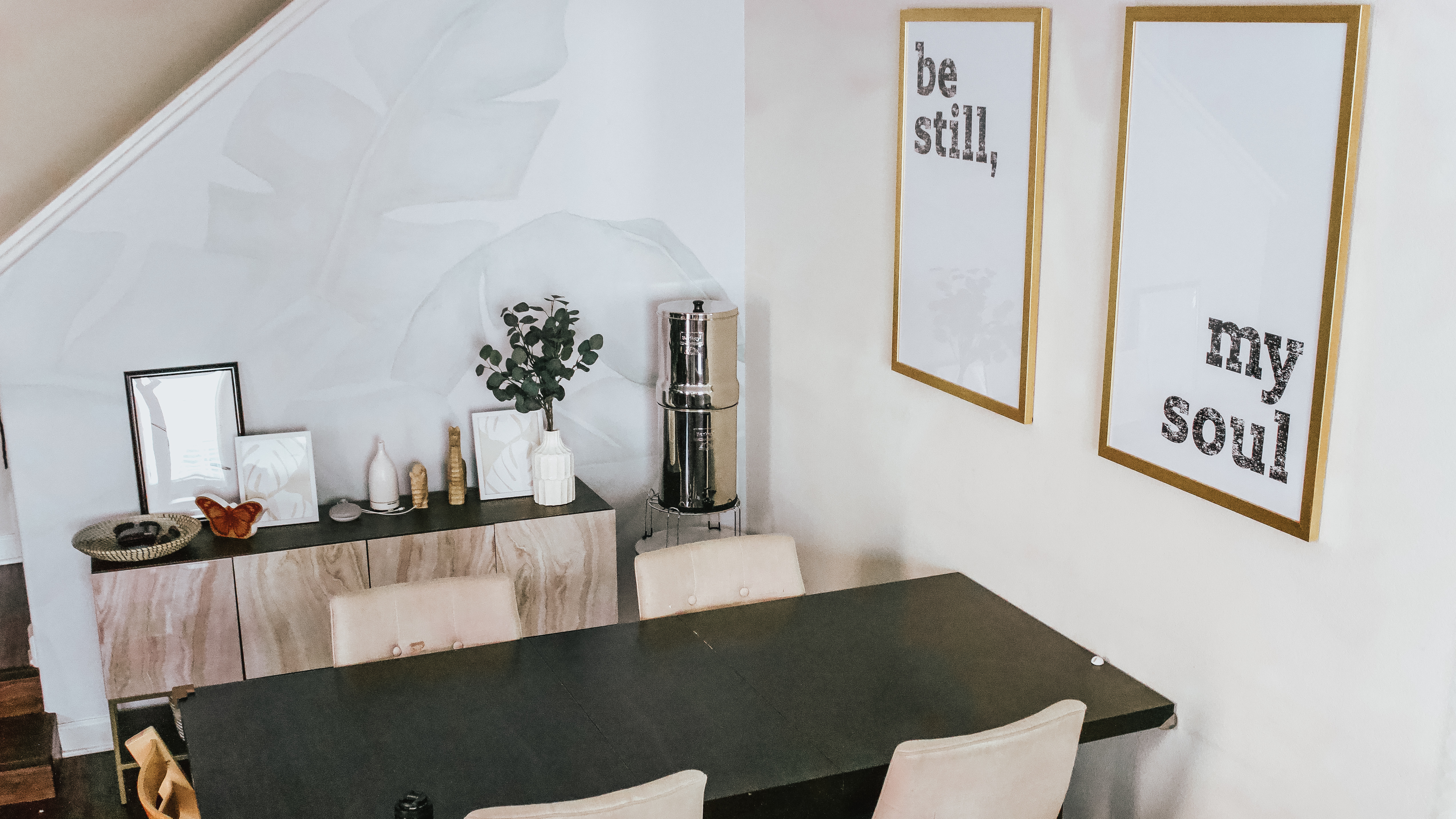
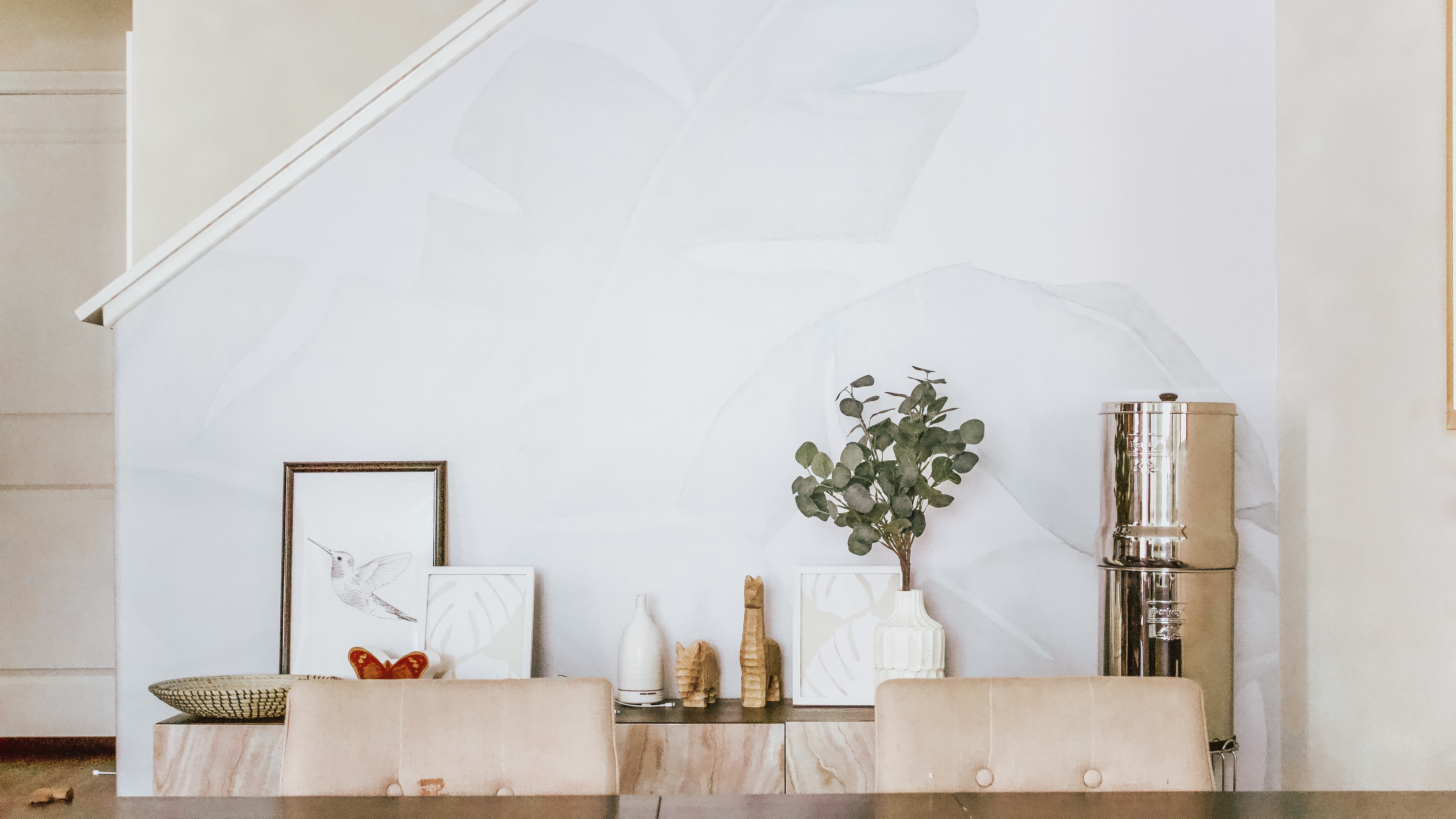
We installed this beautiful renter friendly wall paper print. When you walk in, it becomes the focal point and pulls you in. Of course I picked the most challenging wall ever to put wall paper on because of the angles from the stair, but its so worth it. The self adhesive of that vinyl wallpaper saved me, I literally pulled off the panel like 10 times and still re-adhere to aline it. This is more of a two person job, but I needed Jezriel to hold Enzo while I installed it.
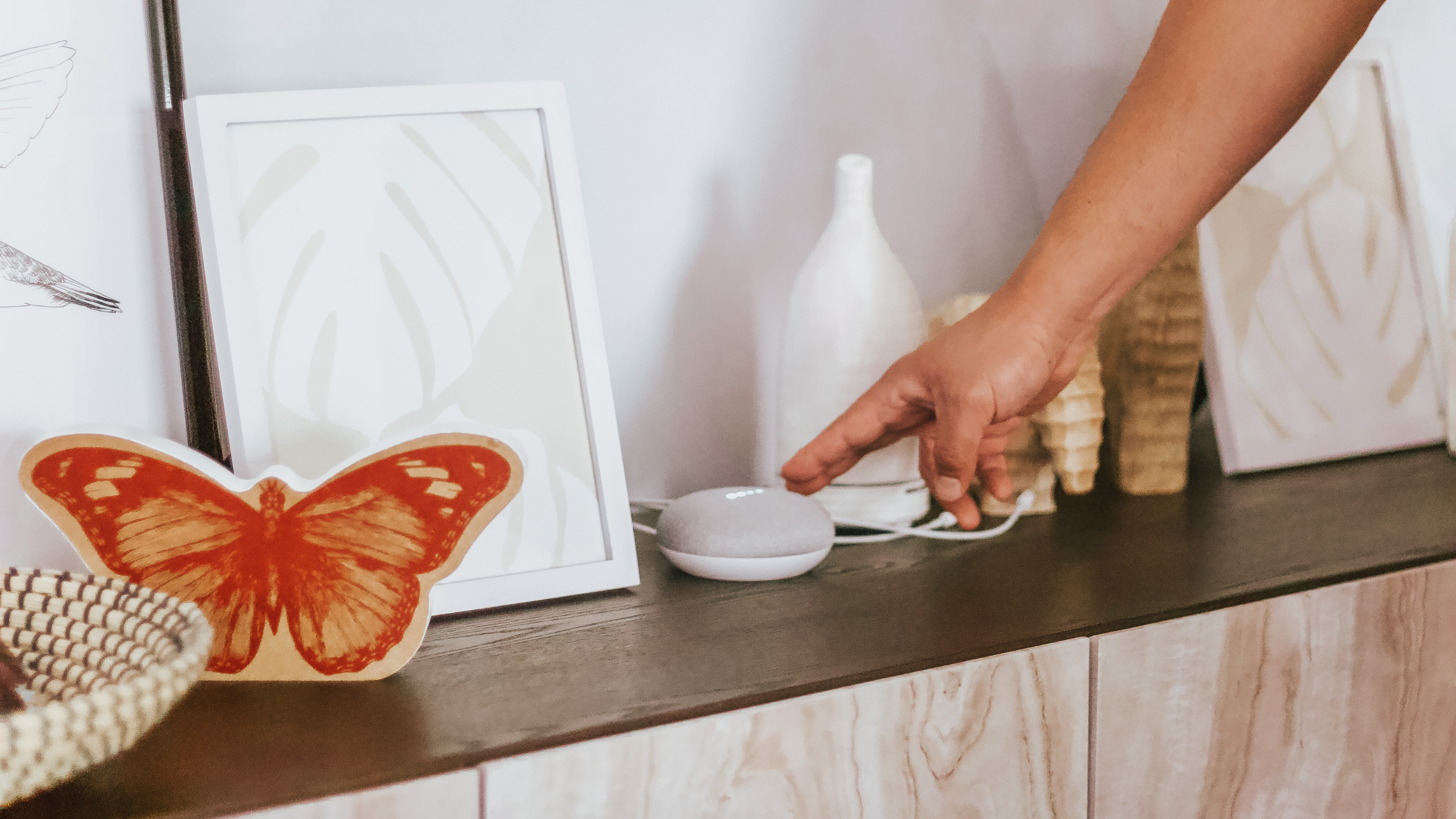
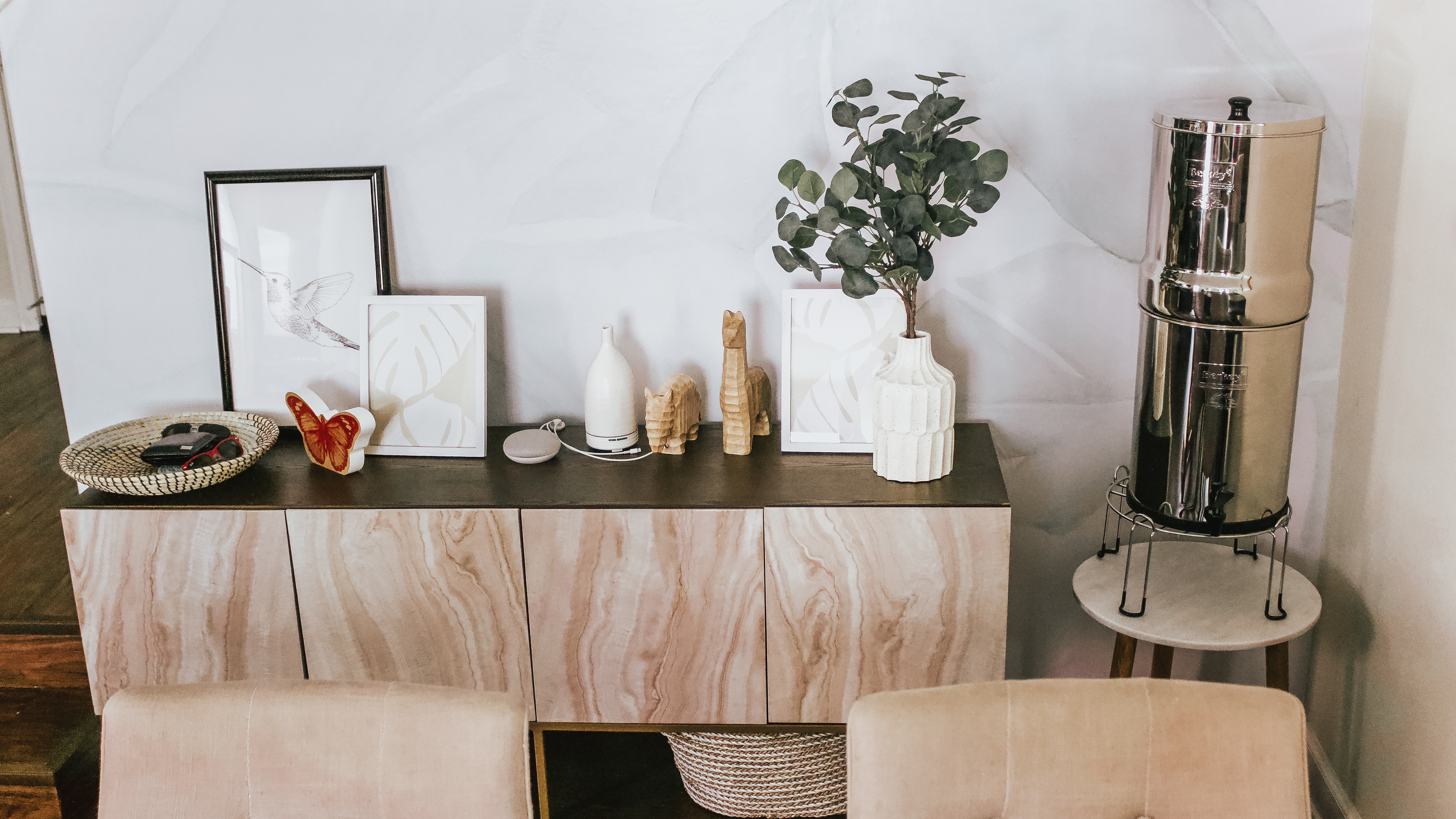
We desperately needed a charging station, a place to lay our sunglasses, wallets, and our Google speaker. An entertainment piece was perfect and not sure why I didn’t think of this sooner. Something not to high to not block the wallpaper and this even has lower shelves so I can, any guesses, place those baskets underneath! And placed the perfect subtle prints into white frames to fluff up the surface without obstructing the wallpaper.
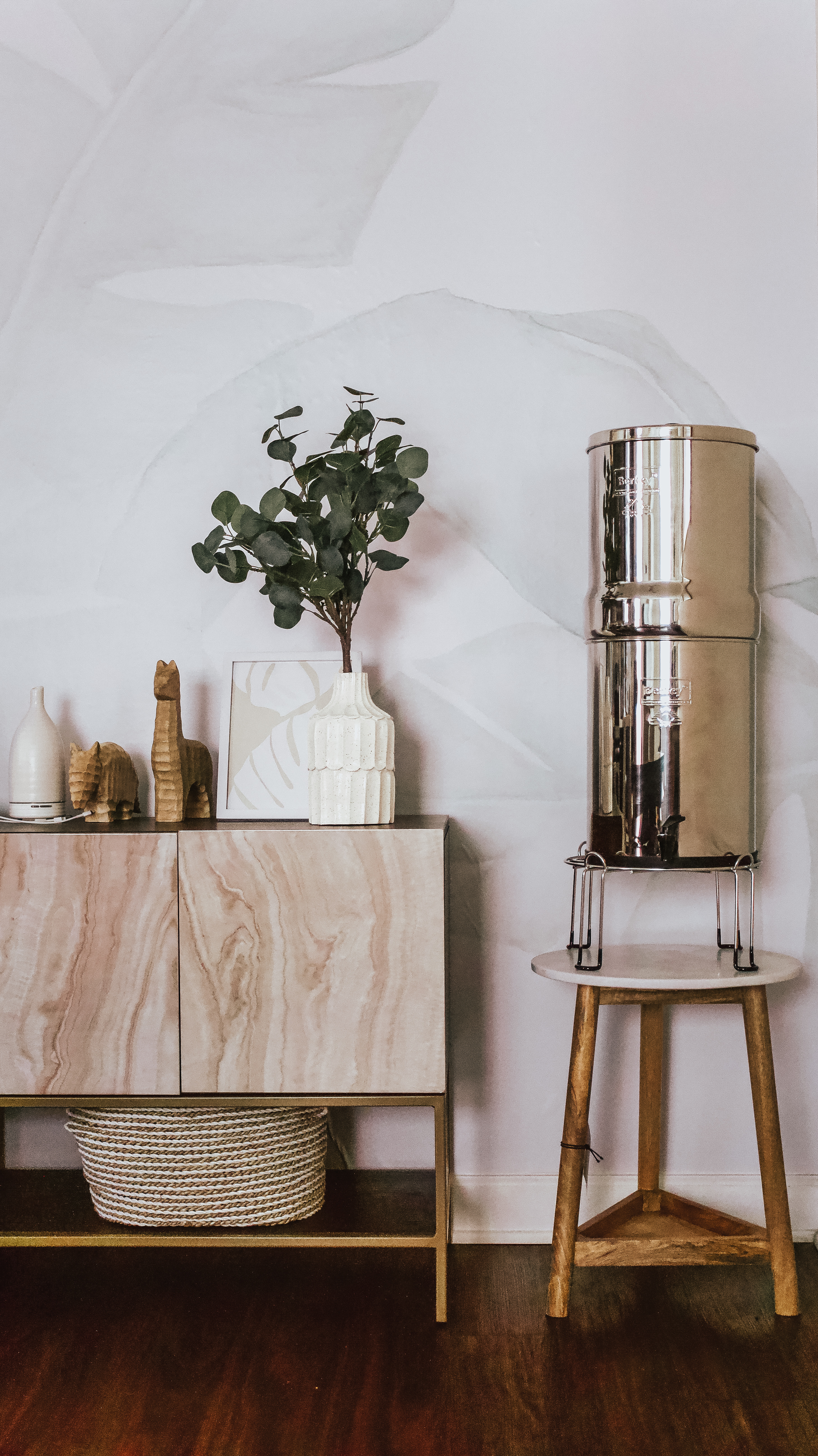
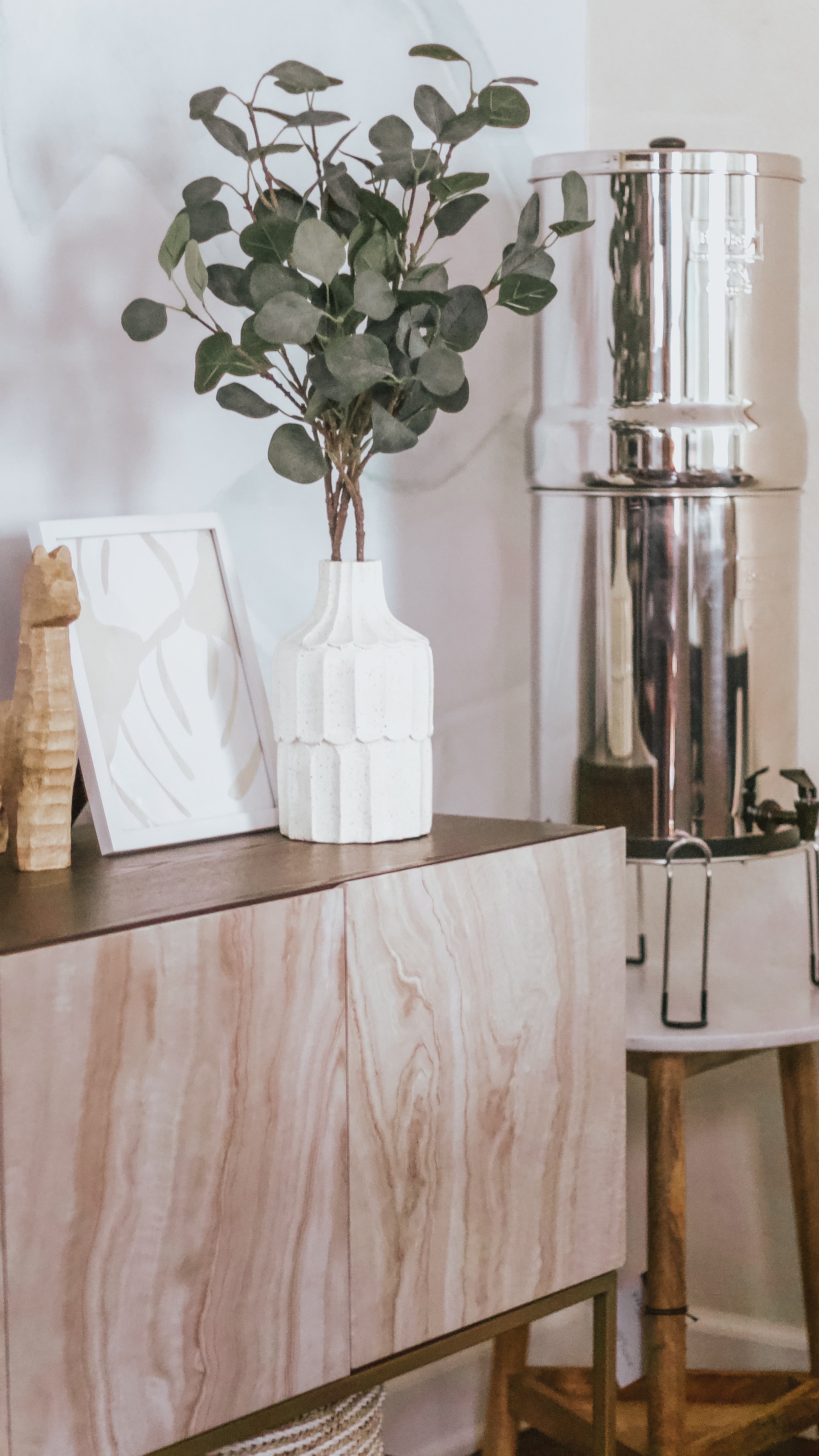
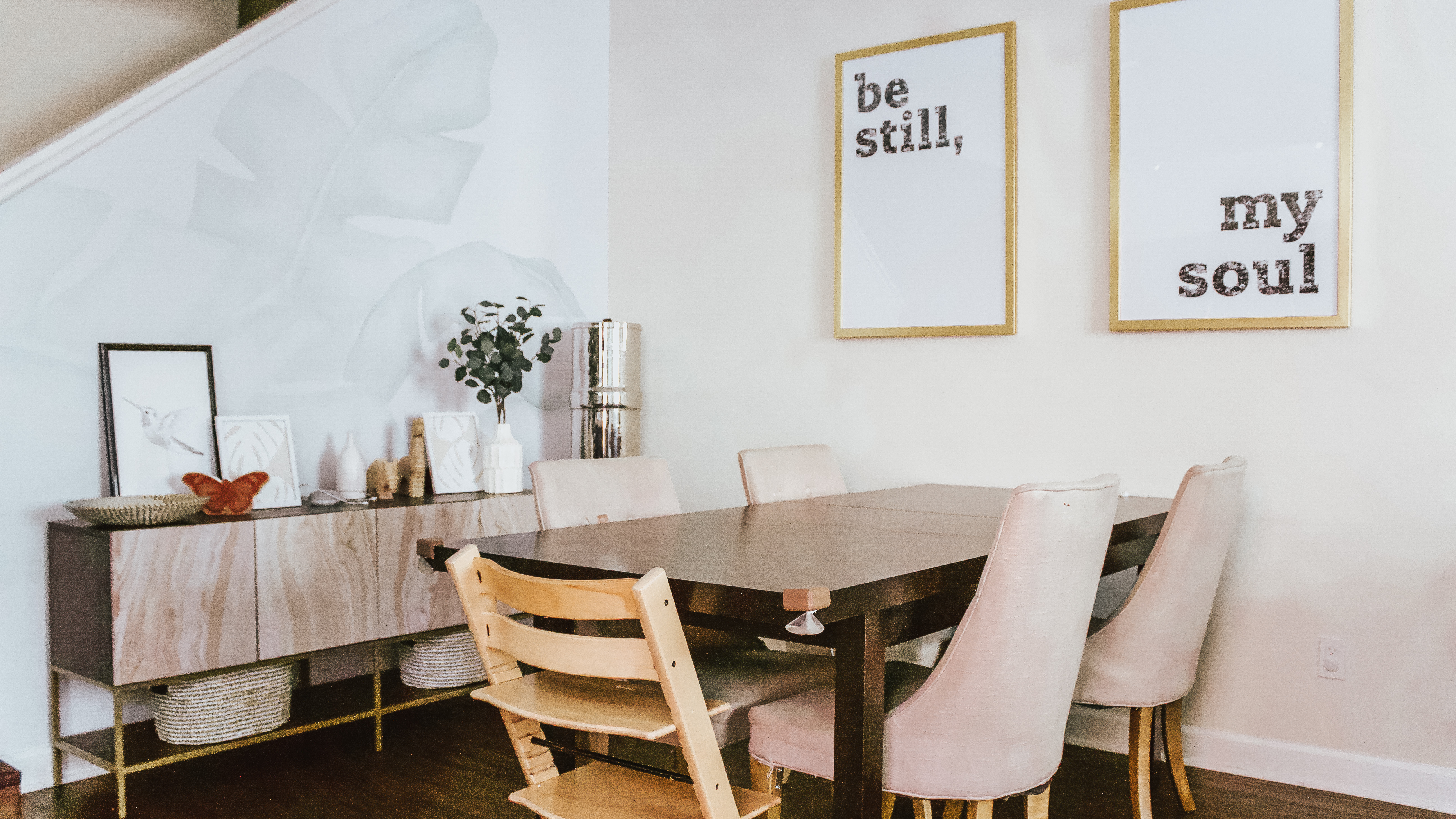
Then I had to have an alternative to our water cooler, it was such an eye sore with the new pieces for me. Thanks to ya’ll I was able to narrow it down to a filtration that actually saves us money in the long run, looks aesthetically better too. Last but not least were these perfectly frames pieces that hang above our dining table. Quoted “be still, my soul” gosh I just love them!
What do you think?


So pinterest worthy! Wow it looks like something from a magazine! Love it
Oh!! Your comment just means the world to me <3
Such a beautiful and cozy space! Gorgeous decor
Thank you. It starting to finally feel like what I’ve envisioned for a long time.
I love those framed prints and that’s a brilliant place to put your water filter. They take up so much space on the counter so I like that you’ve put it in it’s own place.
Oh they do take up space on countertops! We have a quit small kitchen and I tend to hold kitchen appliances >_<
This came together so beautifully, Rai! ? I love the removable wallpaper, it’s fun and subtle at the same time, and my prints look great there! ??
Thank you so much Melanie!! Being in a rental creates some challenges, and glad wallpaper is coming back and renter friendly. Your shop has so many great prints I could just place them everywhere in our space!
The decor is beautiful! I love neutral tones.
All of the earthy tones look so great. I am also a huge fan of these in my home!